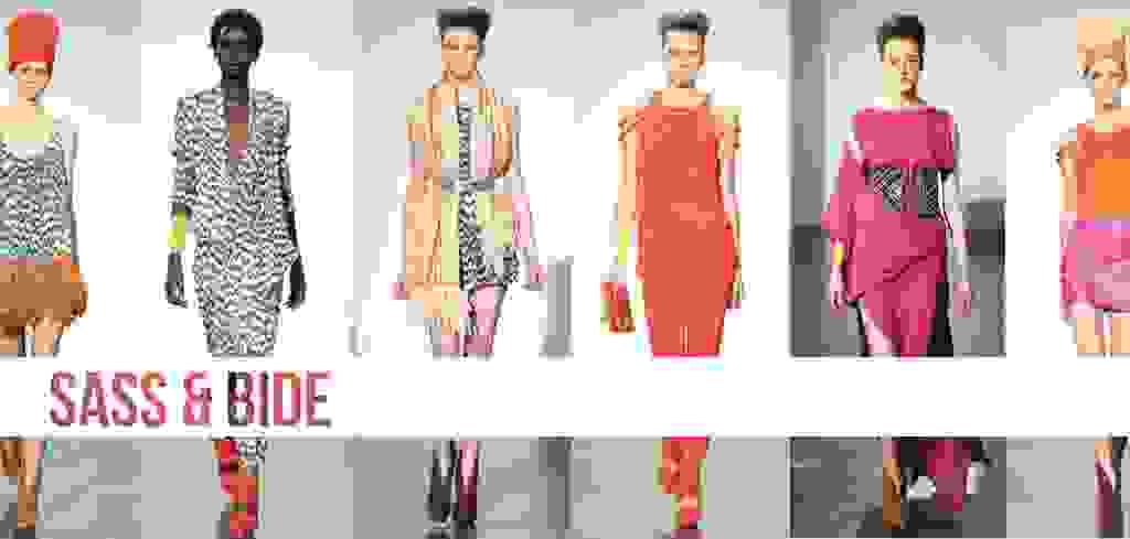
SASS & BIDE
Australian design royalty brought the sunny climes of the Land Down Under to the icy runways of the north in an explosion of daffodil yellow, jumping from a palette of Sass & Bide’s signature metallic and monochrome. The embellishment we have come to expect from design duo Sarah Jane Clarke and Heidi Middleton was slightly more subtle this season, teamed back in unexpected and exciting ways. Intricate beading lined lazer cut-outs, clung to bodices and weaved its way around necklines. Trousers were wide legged and high shine, jackets were boxy and silver knit was in abundance, making way for warrior dresses with caged overlays, drop-waists and cut outs- the Sass & Bide wardrobe we know so well. The pair had elaborated that this was a collection of opposites, about transformation and counterbalance.
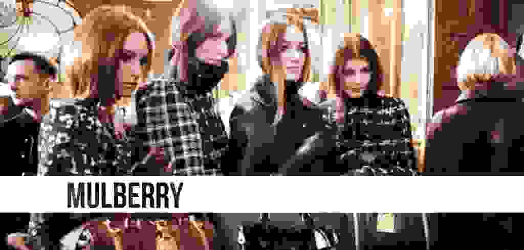
MULBERRY
What goes around in the fashion world well and truly comes back around- this thought resonated throughout Mulberry’s AW13 showing as 90s layering was reinvented. Trousers are the new tights, with both cropped and wide legged styles draped beneath a plethora of skater skirts. It wasn’t 90s grunge, however- it was a mature reincarnation of a once youthful trend. Autumnal florals in forest greens and oxblood reds crept over ever-so-British plaid, dressed down with maroon leather suiting. The aesthetic is well groomed and grown up, but slightly cheeky. Very Mulberry.
MARY KATRANZOU
It would appear that Katranzou, the reigning queen of wearable avante garde (the ultimate fashion contradiction), has taken a darker, more sophisticated design direction. She had been inspired by landscape and the shadowy black and white photography of Edward Steichen, Clarence White and Alfred Stieglitz, translating into prints that were far from the vivid variety we are used to. The collection is surprising in all the right ways. Prints were in abundance, as per the Katranzou aesthetic, but colours were washed out and mysterious. The silhouette is linear, elongated and architectural and landscape vistas are embossed onto the most form fitting of leather. Katranzou’s apparent exploration of both self and fashion is a testament to her design talent.
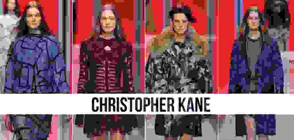
CHRISTOPHER KANE
“The brain works in mysterious ways,” said Christopher Kane backstage. His AW13 collection featured textures previously unexplored by the designer (feathers, camo, brain motifs and razzle dazzle) in conjunction with revisited Kane favourites (floral appliqué, velvet dresses and, of course, the kilts). The designer described the collection as “A celebration. It’s been a great year and I just had so many ideas that I couldn’t live without. That was actually the heavy edit”. Fresh camouflage paved the (run)way for velvet styles, which appeared to pay homage to silhouettes of the designer’s famed Central Saint Martins debut. Kane masterfully took potentially fatal elements, such as feather trimmings, and made them utterly desirable. This collection was truly a celebration of all that the world of fashion has to offer.
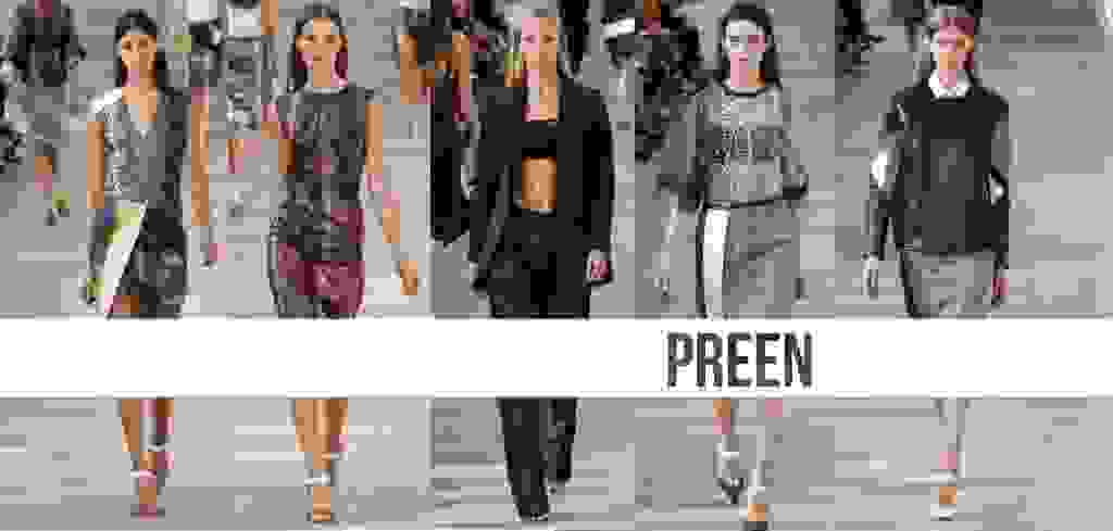
PREEN
Justin Thornton and Thea Bregazzi of Preen used Derek Jarmon’s post-apocalyptic film Jubilee as their starting point and delected red, black and white as their colour palette of choice for AW13. We saw the beginnings of a punk reincarnation in New York, but Preen’s London showing has truly solidified this idea. Zips, leather skirts, biker jackets and studs all played a role in this trend reinvention. Leopard prints and lace textures diffused into one another so that you never really knew where one started and another began. A finale comprising of jewelled embellishment provided a fun respite from an otherwise tame palette. It was slick and defined- the casual luxe one associates with Preen.
TOM FORD
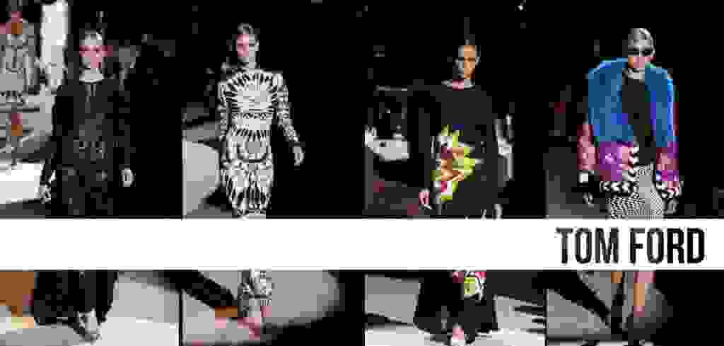
Ford’s last full runway show in 2004 was his swan song for Gucci- a hard act to follow almost 10 years down the track. His AW13 show, however, proved he was playing for high stakes, and was a gallant and admirable return to the international fashion week circuit. “I had forgotten how much fun it is to do a show but I get super nervous,” said Ford post-show. Ford’s vision is uncompromising, unlike so many designers of late. Ford stated that London is an “international city”- the perfect setting to unveil his Native American and Mexican inspired collection. Heavy in fine embroidery and electric patchworking, the international vibe was met with an almost art deco aesthetic- elements that shouldn’t necessarily gel, but somehow did. “I got tired of minimalism, I’m not in the mood for it.” It’s Ford’s way or the highway, and we love it.


Leave a Reply