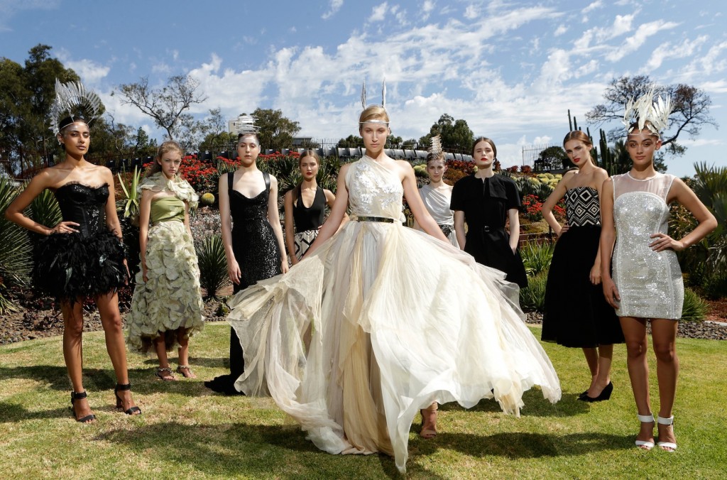
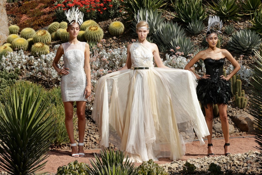
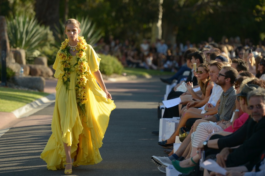
Melbourne’s Royal Botanical Gardens lit up last Thursday night with beautifully dressed models floating down the circular catwalk at Guilfoyle’s Volcano for the Royal Botanic Runway. Featuring four of Australia’s leading designers, Aurelio Costarella, Collette Dinnigan, Martin Grant and Akira Isogawa, the event not only celebrated Australian fashion, but also raised funds for the final stage of the Royal Botanic Gardens Melbourne Water Strategy Project.
The glamorous event highlighted fashions intrinsic link to beauty by partnering with the L’Oreal Professional Products Division as the Official Hair Partner for the event, L’Oréal Professionnel, Redken 5th Avenue NYC, Shu Uemura Art of Hair and Matrix, whilst MAC cosmetics created the makeup looks for the event.
Couturing visited backstage at the Royal Botanic Runway to speak to each of the hair directors to find out their inspirations for the looks created for each of their respective designers.
L’Oreal Professionnel for Aurelio Costarella
L’Oreal Professionnel Hair director Jamie Furlan from Xiang QV created a look that he described as “clean, classy and sophisticated”. The hair look involved a deep side parting and pulling the hair back into a twisted bun at the nape. Jamie described the looks as being “very fashion forward without being too complex…I’ve worked a slight 90’s feel into it by creating a soft rise at the roots around the hair line…but it’s the sleekness and shine which gives it a sophisticated finish.”
Key Products: L’Oréal Professionnel tecni.art Volume Lift mousse, L’Oréal Professionnel Liss Control cream and L’Oréal Professionnel Infinium Hairspray www.lorealprofessionnel.com.au
Shu Uemura Art of Hair for Akira
Stavros Tavrou, Shu Uemura Art of Hair Artist, from Rakis on Collins, was inspired by Japanese origami folding techniques, with the hair was pulled completely off the face and positioned asymmetrically at the back of the head just below the crown. The lengths were then folded through to create a bun shape and the lengths wrapped and folded at the base. “The bun is a creative take on the sumo knot while the texture of the hair is very organic and free which gives a beautiful softness to the overall look,” comments Stavros.
Stavros used Shu Uemura Art of Hair Deepsea Foundation to prepare the hair and texturised with Shu Uemura Art of Hair Satin Design which he said provided natural polish to the look. He finished the look with Shu Uemura Art of Hair Sheer Lacquer.
Key Products: Shu Uemura Art of Hair Satin Design, Shu Uemura Art of Hair Sheer Lacquer and Shu Uemura Art of Hair Deepsea Foundation www.shuuemuraartofhair.com
Redken 5th Avenue NYC for Collette Dinnigan
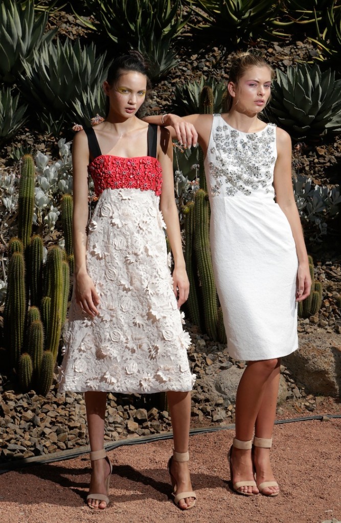
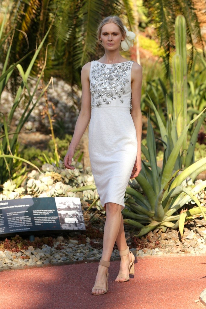
Redken’s Mark Thompson created a beautiful feminine style to complement Collette Dinnigan’s designs. Of his look, Mark called it a ‘modern day take on an old classic’. The models were seen wearing their hair braided low, which was then twisted and folded into a low bun and secured at the nape. “The hair look is very beautiful, clean and expensive…It’s a modern take on a Grecian goddess look with a little 70’s inspiration in there too thanks to the twisting and roping techniques used at the back” says Mark. To create the look, three braids are twisted at the back and pinned together in the shape of a V.
Mark used Redken’s new Pillow Proof Blow Dry Express Primer which helps to speed up blow drying by up to 50% and leaves the hair shiny. He then used Redken’s Move Ability 05 defining cream paste to prepare the braids before twisting and pinning it back and using Redken Control Addict 28 Hairspray to leave a feminine and goddess look.
Matrix for Martin Grant
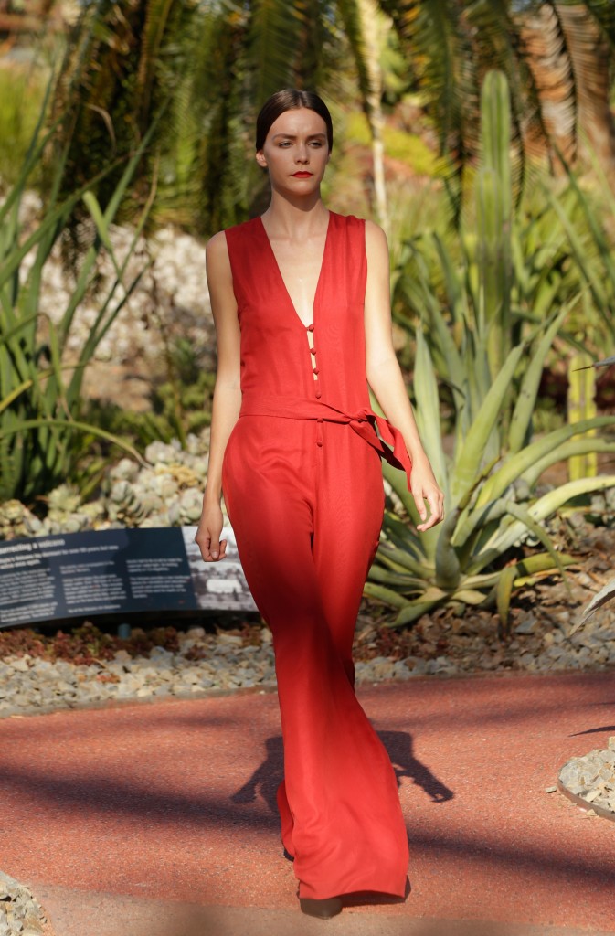
Andrea De Deugd, Matrix Hair Director said that the inspiration for the look came from Martin himself, something that complemented his design. “The beauty of this look is in its simplicity…I’m calling it the Couture Ponytail…even though the style is classic what makes it more luxurious is the healthy, beautiful shine and the strong center part…the hair looks gorgeous and really polished,” continued Andrea. The models dressed in Martin Grant’s design wore sublime, sleek ponytails with a strong, clean center part and secure at the nape. The hair on either side of the face sat over the ears to create a sleek line and to frame the models faces.
Key Products: Matrix Design Pulse Go Big Mousse, Matrix Design Pulse Surround Shine and Matrix Design Pulse Smooth Shield Hairspray. www.matrixaustralia.com
Makeup by MAC Cosmetics
Make up was kept simple and natural. MAC Makeup director, said the focus was on creating beautiful skin that looked like it was natural, using MAC’s Mineralised foundation as a base.
Bursts of colour were added for each of the Designer’s looks. Pastel on the eyes were used for Akira whilst metallic eyes were the look for Aurelio, using MAC pigments in silver and gold. Lips kept simple and glossy using MAC’s Honey Love lipstick.
The look for Collette Dinnigan included simple highlight and shadow around the eye in natural colour, with soft blush cream and soft lips.
The focus for Martin Grant was on the eyes, with mascara creating a heavier lash, with shadowy eyes and bold red lips.
Images by Lucas Dawson Photography

Leave a Reply